


Breaking down the MLB 'City Connect' Uniforms
The Good, the Bad, and the Ugly

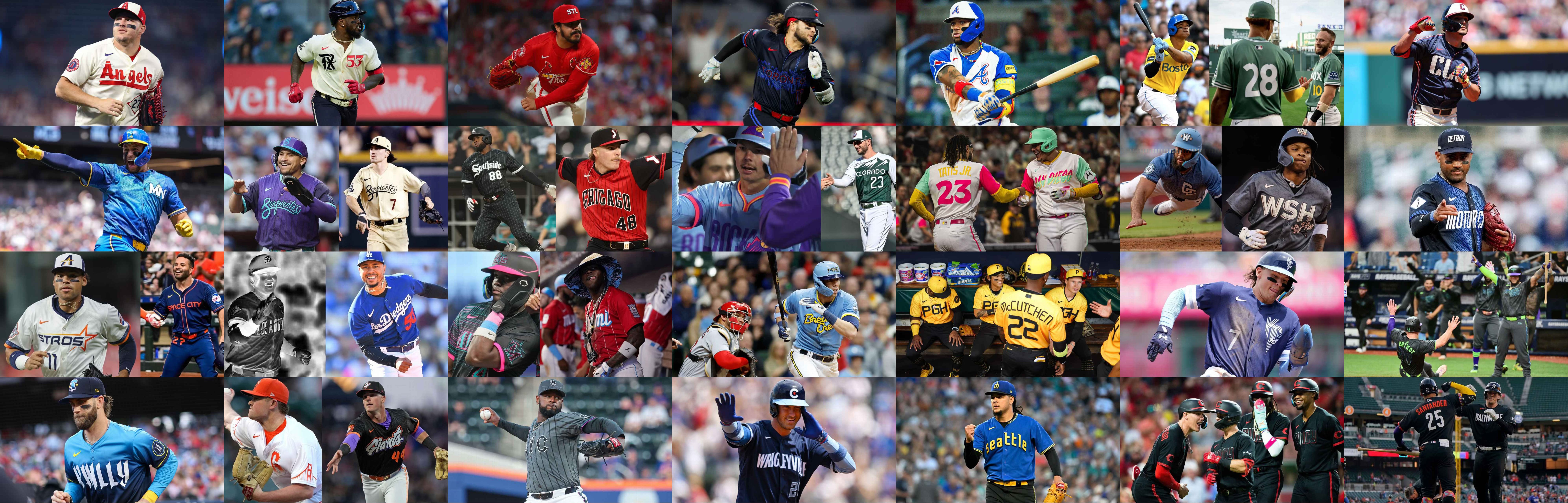
In 2021, something rooted in the NBA crossed over into the MLB. No, I’m not talking about a new Michael Jordan trying to become the next two-sport athlete. I am talking about City Connect uniforms. (In the NBA they are called City Edition but it’s the same idea.) This was the first notable aesthetic shake up to MLB uniforms since Nike took over as the exclusive uniform provider in 2020, ending the 15-year reign of Majestic (RIP1). In their debut season, City Connects graced the backs of seven different teams, with seven more joining the ranks in 2022 and six more launched in 2023. 2024 brought with it eight new teams (and one relaunch) bringing the total to 28 (out of 30 teams). With the slow rollout, only the most dedicated fans focused on the relatively niche aspect of uniform details paid much attention to these new wares.
However, now that most teams (the Yankees and Athletics being the only exceptions, for massively different reasons2) have their own way to “connect” to their city - a handful even have new iterations beginning in 2024 and expanding in 2025 - there have been several breakdowns and rankings that I have found online. They’re all really bad. So this is my breakdown of which of these are actually good and which will be brought up in future discussions of the most questionable MLB uniforms of all time.
In order to come up with the most scientific and consistent scoring system, let me identify the factors that will go into grading each one.
Aesthetics - Do the uniforms actually look good? Factors include, but may not be limited to: colors, logos, layout.
Connection - How well do the uniforms live up to the ethos of their name?
Practicality - do these make for practical MLB uniforms? This will be rarely used but will factor in to at least a few of my assessments.
Scoring Note: Aesthetics and Connection will be graded on a 10 point scale and the average will be taken from these for a final score. If there are practicality concerns, that will be a simple (-1) from the resulting score.
Arizona Diamondbacks - 2021 (V1), 2025 (V2)


I like both of these, but I like the re-run a little more. Both nod to the hispanic heritage of Arizona with a Spanish translation of “snake” as their adopted “name”, but the new version also nods to the (short) history of the team, something all “lifetime” D-Backs fans should be here for.
The Diamondbacks everyday uniforms have been all over the place in their quarter-century in the league, rocking teal, purple, and black for their first 9 seasons before completely abandoning their colors in 2007 to align with the red and black uniforms of the Cardinals and Coyotes (RIP). This uniform-set would also last just 9 years until being “evolved” to include teal as an accent once again.
This is why I like the 2025 version, as it incorporates that history of the team with the purple and black combination, while also honoring its 2001 World Series championship with references on the sleeves. The new jerseys also incorporate a unique, snakeskin-inspired pinstripe and come with a new S (for Serpientes) logo on the hats and helmets. However, what the 2025 version adds with nods to the history of the team, it loses in representation of the city or state, which the 2021 version had with its pale gold color reminiscent of desert sand.
2021 Grade - Aesthetics: 7, Connection: 4, Overall: 5.5
2025 Grade - Aesthetics: 8, Connection: 4, Overall: 6
Atlanta Braves - 2023
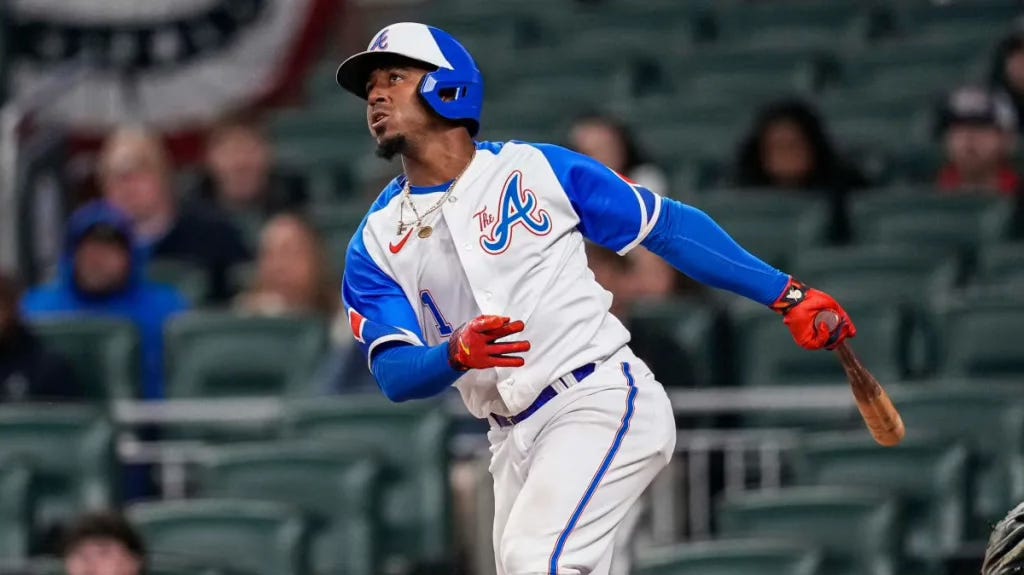
These uniforms are great - aesthetically. They take inspiration from a unique set of uniforms used for just 4 seasons between 1972 and 1975. Despite their short reign, this included the year - 1974 - that Hank Aaron broke Babe Ruth’s home run record. (Further references to Hank include “715” at the interior back neckline and “Keep Swinging - #44” down by the laundry tag. Similarly to the 2025 Diamondbacks City Connects, however, these allude much more to the team history than the actual city, with the only reference being the chest logo reading “The A”, which I am led to believe is what people from Atlanta call the city.
Grade - Aesthetics: 9, Connection: 4, Overall: 6.5
Baltimore Orioles - 2023
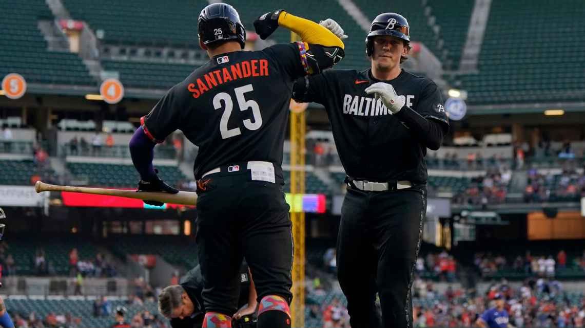
Now these are just bad. Aesthetically there’s nothing going on. The only color comes in the form of printed interiors (in some nonsense pattern), the Nike logo, and the player names. The block letters are apparently in a font inspired by the Globe Collection and Press at Maryland Institute College of Art, but who would know that? The only other reference to the city is a line by a Baltimore-based poet - but that doesn’t seem to be widely adopted by the city - also represented on the interior of the unis, this time in the sweatband of the hat. Weak aesthetics and weak city-connection aside, the worst thing about these is the all-black look. Wearing all black to play baseball - famously an outdoor summer sport - will never make sense, even IF it looks cool.
Grade - Aesthetics: 1, Connection: 1, Practicality: (-1), Overall: 0
Boston Red Sox - 2021 (V1), 2025 (V2)


The Boston Red Sox were the first to release their City Connect uniform in 2021 and they came with a splash, abandoning their classic red in favor of a yellow and light blue scheme in reference to the Boston Marathon, inclusive of a 617 area code patch on the sleeve that resembles a marathon bib. Aesthetically they’re just so-so. Yellow is a hard color for most to pull off, but they thread the needle pretty well with the complimenting light blue. The connection to the city of Boston is where these shine, however, with the marathon long being an iconic event bringing the city together even before the 2013 tragedy.
I think the 2025 update works a bit better aesthetically, with green jerseys color-matched to the iconic Green Monster. The color isn’t the only reference to the wall; further details include the notched back numbers, the yellow front numbers, and red and yellow dots by the front label all referencing elements of the scoreboard that graces it. Green also has much more of a connection to the Red Sox than yellow, having been the color of some iconic St. Patrick’s Day alternate jerseys of years past. There’s no real effort to make a connection to the city outside of the stadium though.
2021 Grade - Aesthetics: 5, Connection: 8, Overall: 6.5
2025 Grade - Aesthetics: 9, Connection: 3, Overall: 6
Chicago Cubs - 2021
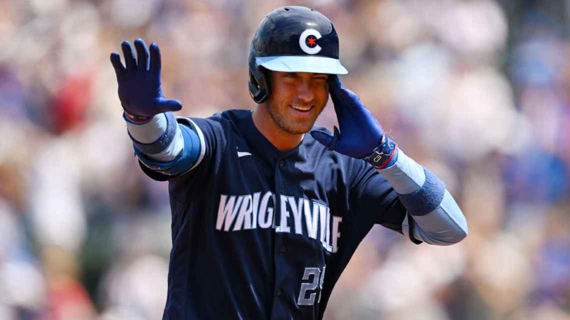
These jerseys are far from offensive, but veer toward boring. “Wrigleyville” graces the chest, referencing the nickname of the neighborhood in which they play (which is of course named for their stadium - a little bit of a circular reference here). The highlight is probably the small 6-pointed star in the middle of the C on the hats and helmets which is borrowed from the admittedly cool Chicago flag. Where these really go off the rails, however is the choice to include matching navy pants. Though not as bad or impractical as all black, this is really not a great look.
Grade - Aesthetics: 3, Connection: 3, Overall: 3
Chicago White Sox - 2021 (V1), 2025 (V2)


The original “Southside” White Sox City Connects are among my favorite iterations in the collection, black pants notwithstanding. The pinstripes running through the officially dark grey (and subtly patterned) jerseys and pants really help with the aesthetics here and read like a dark alternate to their standard home jerseys. The “Southside” text in a gothic font allude to both the team’s identity as that of the south side of the city as well as that area’s connection to hip hop.
In contrast, the 2025 version falls completely flat for me. The jerseys are a not-so-subtle reference to Jerry Reinsdorf’s other team, the Chicago Bulls. While you can’t blame the team for wanting to switch it up after posting a record number of losses in 2024, just wholesale copying a team from a completely different sport - down to the mock-tank styling - just feels like giving up on having your own identity.
2021 Grade - Aesthetics: 9, Connection: 5, Practicality: (-1), Overall: 6
2025 Grade - Aesthetics: 1, Connection: 1, Overall: 1
Cincinatti Reds - 2023
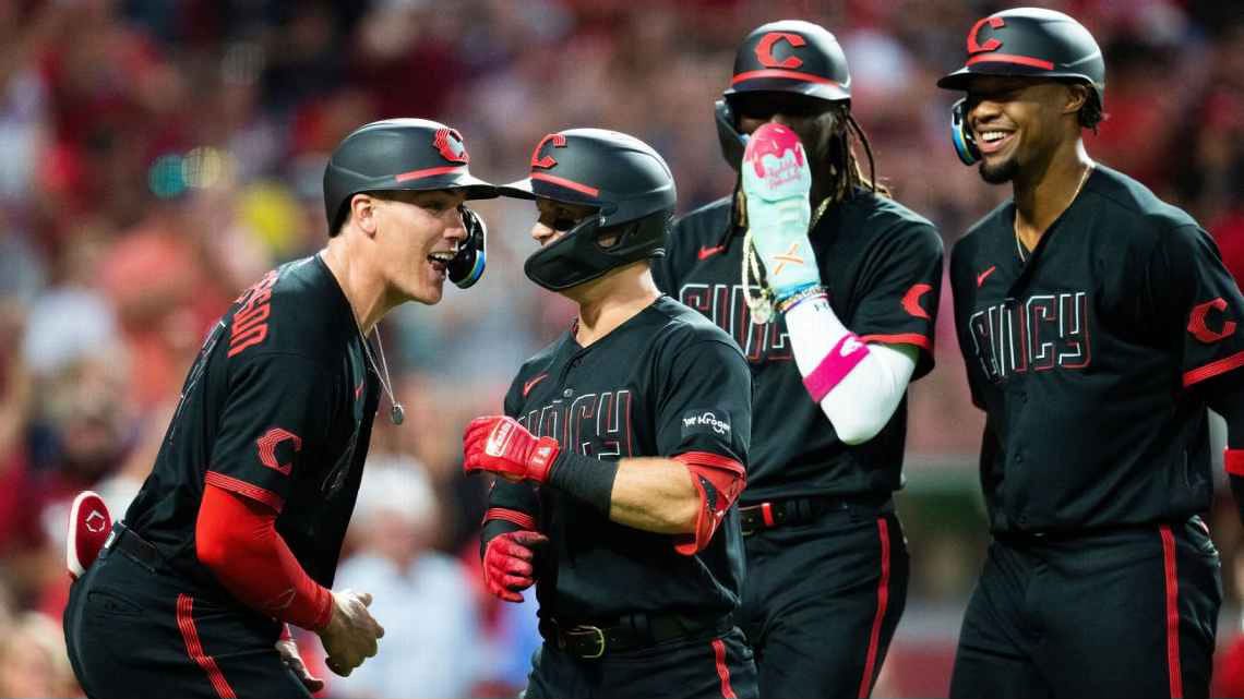
The modern Reds uniforms are among the worst in the league in my opinion, just for being incredibly boring. They have a couple of alternates that are at least interesting and nod to their 140+ years of being a franchise but their City Connects, on the other hand go the opposite way, opting for a hyper-modern look in all-black and the colloquial “Cincy” adorning the chest. The C-logo is the one positive, made up of 5 lines representing their 5 WS titles, but that hardly makes up for the rest.
Grade - Aesthetics: 2, Connection: 2, Practicality: (-1), Overall: 1
Cleveland Guardians - 2024
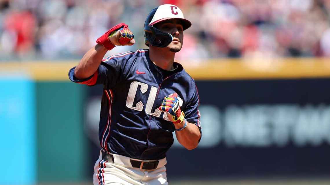
This is one where I diverge severely from the opinion of whoever wrote the ESPN grading of all of these. He gave these a D. However I think these hit on all the right notes. The “CLE” at the chest references the common abbreviation of the city and the airport, but the more interesting nod here is the patterning applied to the letters, which reference the Guardians of Traffic statues which adorn the Hope Memorial Bridge (and which lended their name to the team). The rest of the unis aren’t doing all that much but they don’t need to either. Just solid all-around.
Grade - Aesthetics: 7, Connection: 6, Overall: 6.5
Colorado Rockies - 2022 (V1), 2025 (V2)


The Rockies, unlike their expansion-team brethren Diamondbacks in the NL West, have stayed true to one main identity in their 32 years as a franchise. Purple, black, grey, (and white), pinstripes, tank tops. So both of these mark a huge departure. Both hit in some ways, but also have significant weaknesses as a contrast to the strong identity they have already developed. Points to them for trying, but they haven’t quite hit the mark (not dissimilar to their on-field performance as of late).
Both lean strongly into the mountain theme, in vastly different interpretations. In 2022, they went with a relatively realistic representation at the chest above a pretty boring block font (borrowed from Colorado’s license plates), executed in a muted dark green and white, which also comes from the state’s license plates. They may not use any of the team’s signature colors, but they don’t clash either. I don’t like them with the matching green pants, but with white they work. I could even see these being used as the basis for a total rebrand - god knows they could use it. They would need to do something about the hat, though.
2025 brought a much louder and modern version, incorporating purple, light blue, pink, and yellow meant to invoke scenic Rockies sunsets. The combination of colors, in addition to the use of pullover jerseys, is somehow both hyper-modern and retro. And thank god they addressed the problem with the hat, now sporting arguably one of the best hats in the game. This might be a little loud as a main uniform in the MLB, but if anyone needs a complete overhaul of their identity, it’s the Colorado Rockies.
2022 Grade - Aesthetics: 7, Connection: 5, Overall: 6
2025 Grade - Aesthetics: 8, Connection: 3, Overall: 5.5
Detroit Tigers - 2024
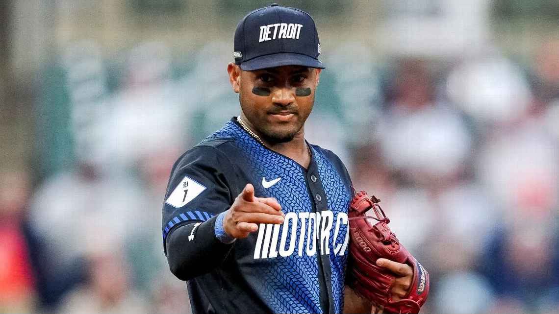
This one is one of the hardest ones to grade. There’s a lot to love but there’s also a lot to hate. Let’s start with the good. “Motor City” seems like a no-brainer, as perhaps one of the best-known city nicknames. The jerseys are rife with additional automotive references, including a sleeve patch referencing the nation’s first paved roadway, M-1, sleeve tape mirroring hazard stripes, a “VIN tag” printed inside the back neck, and of course the tire tread running through the middle. So that’s the good. The bad starts with the incredibly boring and clunky “DETROIT” written out on the hats and ends with the deep navy pants. It’s a shame that they squandered all the potential of these jerseys by missing on the rest.
Grade - Aesthetics: 2, Connection: 9, Overall: 5.5
Houston Astros - 2022 (V1), 2025 (V2)


One word: Space. If everyone associates one thing with Houston, it is its connection to space - specifically, to manned spaceflight in the United States. After all, that’s where the Astros name comes from in the first place, so it makes perfect sense to lean into this connection for their City Connects. However, when it comes to the actual execution for both of these, Houston, we have had a problem.
2022’s version definitely brings more to the table in directly referencing the city and its space connection and the NASA-inspired fonts are a sure plus, but these uniforms lose points for me with the decision to use matching blue pants. The hat logo is also comparatively boring.
2025 brought an aesthetic upgrade, going with classic whites complimented by bright hits of color, but lost the unique design elements that tied to the city’s space history. As the ESPN writer noted, these would make more sense as a general rebrand if they were to spell out the whole team name on the chest instead of the clunky “Stros” abbreviation.
2022 Grade - Aesthetics: 5, Connection: 6, Overall: 5.5
2025 Grade - Aesthetics: 7, Connection: 3, Overall: 5
Kansas City Royals - 2022
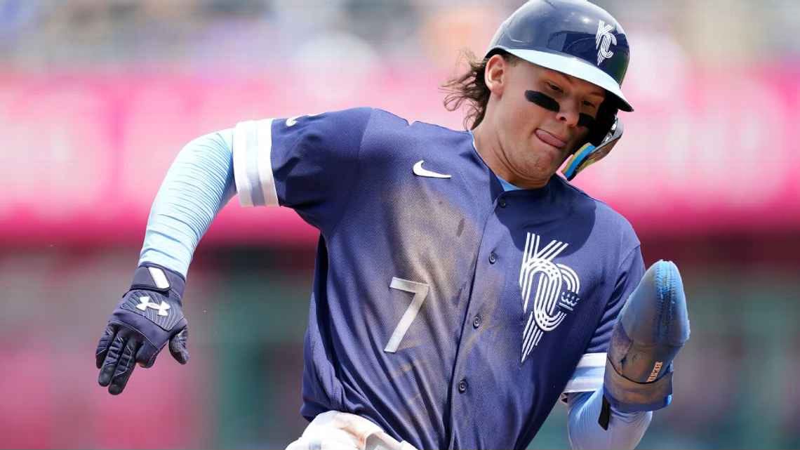
These rank among the most boring of the City Connect uniforms. Subtle references to the city include the chest logo evoking the city flag and a reinterpreted crown logo representative of the fountains the city is known for. The navy color supposedly ties to Kansas City sports teams of old, while the powder blue alludes to past Royals eras. There’s nothing really offensive here, but there’s nothing groundbreaking either.
Grade - Aesthetics: 6, Connection: 3, Overall: 4.5
Los Angeles Angels - 2022
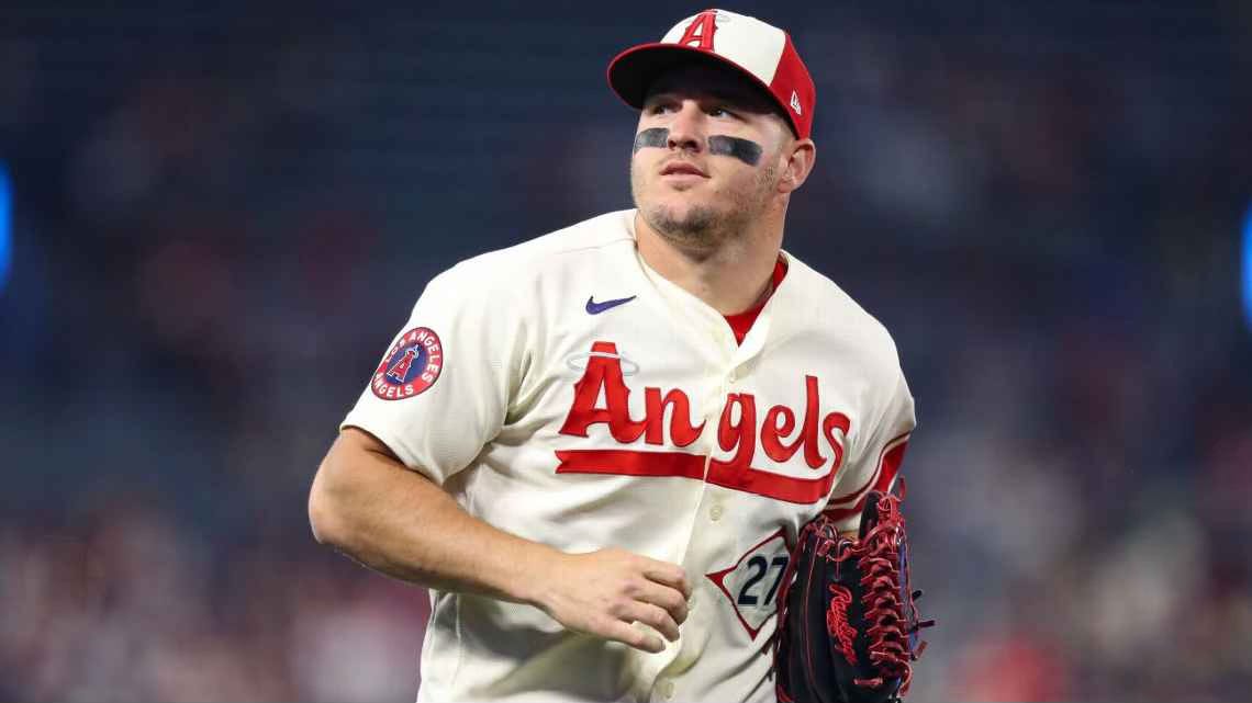
Leave it up to one of the league’s most boring teams to have a quite boring, but incredibly effective, City Connect uniform. The cream color is inspired by the sandy beaches of Southern California, while uniform elements reference surfing, skate culture, lifeguards, and local palm fronds. They nailed this one.
Grade - Aesthetics: 9, Connection: 9, Overall: 9
Los Angeles Dodgers - 2021 (V1), 2024 (V2)


The Dodgers’ City Connects are a tale of 2 approaches. Their first attempt, Dodger Blue jerseys featuring Los Dodgers really took no risks outside of the color. They read very similar to their everyday uniforms, with the “Los Dodgers” text referencing the hispanic heritage of Los Angeles and the team’s fanbase.
The “Los Dodgers” jerseys seem to have been pretty universally hated - at least by the other people who have cared enough to grade City Connects, so it should come as little surprise that the Dodgers were the first team to unveil a second attempt, in 2024.
The only problem? They biffed it. They completely lost any connection to the Dodgers iconic everyday unis. The most notable elements are focused on the team’s move to LA, with the chest text inspired by the LA Coliseum and numbers supposedly inspired by midcentury typefaces. The jerseys also have a funfetti-like pattern, which is meant to represent a “galaxy of stars”, representing the “brilliance and diversity” of the people of LA. For some reason, they also made a new LAD logo which combines the iconic interlocking LA with the script D from their everyday jerseys. Don’t even get me started on the name placement on the back. It’s giving slow-pitch rec league.
2021 Grade - Aesthetics: 8, Connection: 3, Overall: 5.5
2024 Grade - Aesthetics: 2, Connection: 5, Overall: 3.5
Editor’s Note: The initial iteration of the “Los Dodgers” unis incorporated matching blue pants and the hats also said “Los Dodgers”. This is admittedly awful, but my grade is based on where they ultimately landed in 2023, as pictured above.
Miami Marlins - 2021 (V1), 2025 (V2)


The Marlins are one of those expansion franchises that have struggled to develop their own identity, which flows through to their City Connects. The 2021 edition references a short-lived Minor League team from Cuba, connecting to the large Cuban population in South Florida. The 2025 version attempts to bridge the past and the future, but is completely lost in the present. The Miami Vice colors are nice, but the execution leaves much to be desired. The one highlight of these for me is the gradient stripe down the side of the pants.
2021 Grade - Aesthetics: 8, Connection: 2, Overall: 5
2025 Grade - Aesthetics: 2, Connection: 5, Overall: 3.5
Milwaukee Brewers - 2022
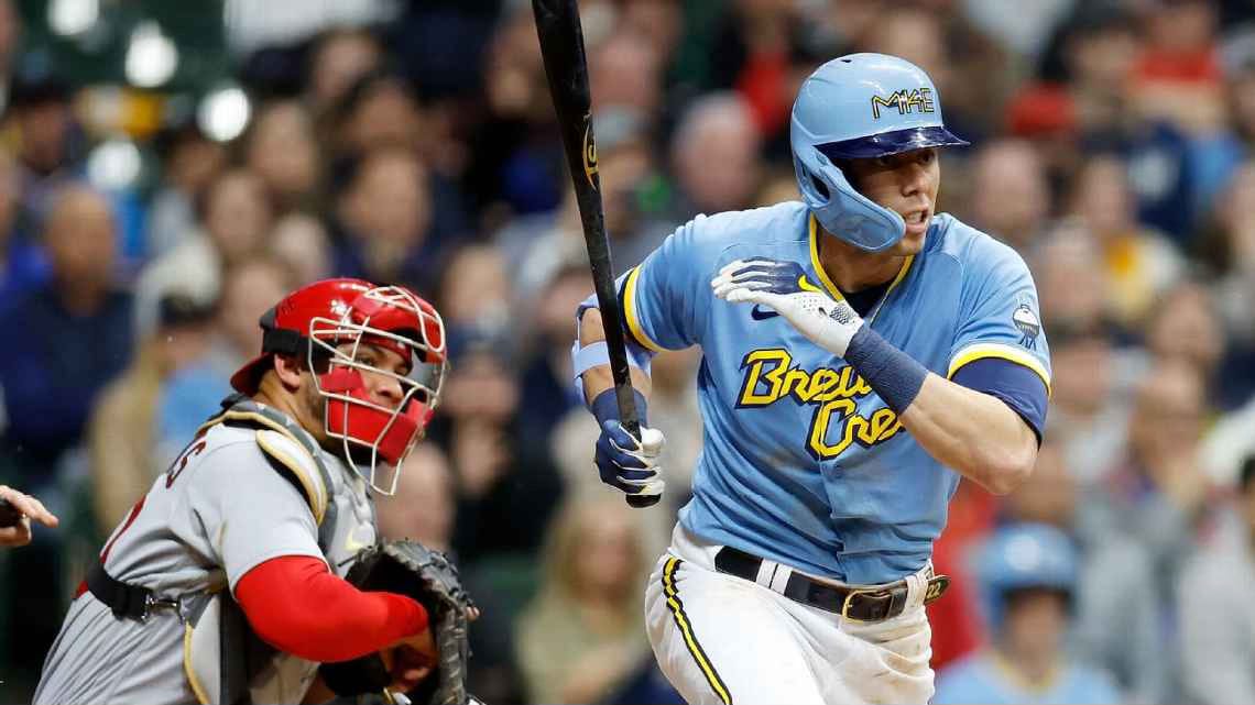
The time has finally come for me to share my thoughts publicly on my own team’s City Connects. I want to like these. I like the fact that they incorporated the powder blue for the first time since abandoning it as their Away uniforms in the 80s, but I wish they used it as a regular alternate instead of the navy. I appreciate the “Brew Crew” chest graphic representing the fan nickname for the team, but hate the execution. I like the grill patch even if it’s a bit kitschy. Worse still than the chest graphic is the MKE/414 hat/helmet logo. I also just learned that the yellow and white sleeve trim is meant to represent the foam on top of a well-poured beer, which is a great touch in theory, but could be better executed.
Grade - Aesthetics: 4, Connection: 6, Overall: 5
Minnesota Twins - 2024
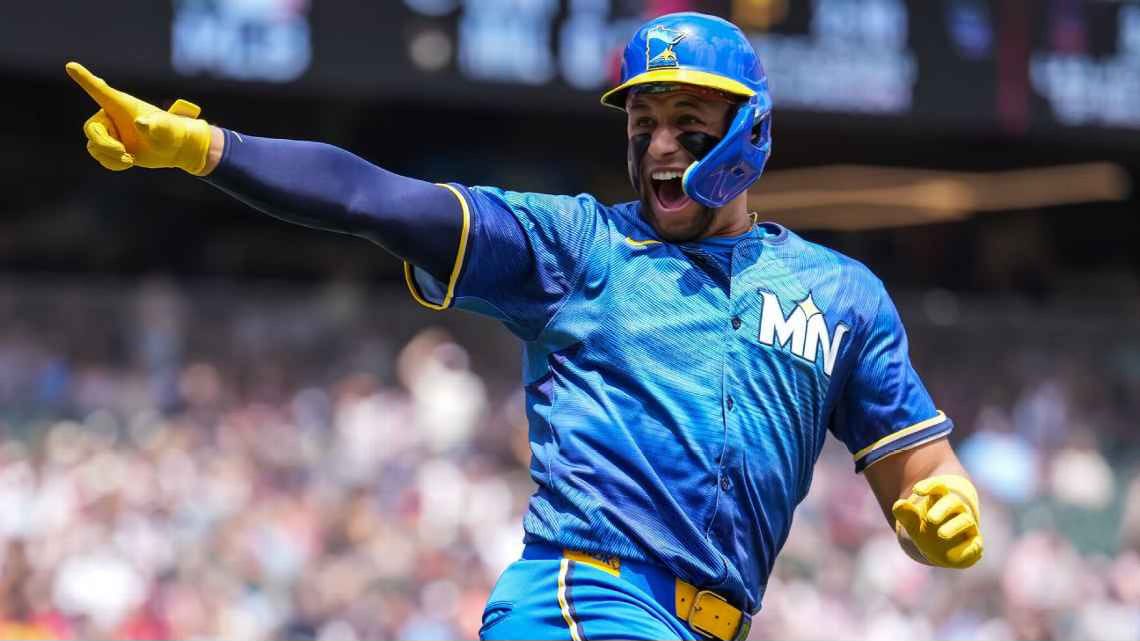
This is a hard one to grade. The jerseys are great. The “Ripple Effect” pattern and the gradients from light to dark blue are genius and effective references to the “Land of 10,000 Lakes” which form the inspiration for these unis. The yellow contrasts perfectly against the blue and acts as a representative of the North Star, a motif used throughout. The Loon sleeve patch couldn’t possibly be better executed. But then they ruined the whole thing by pairing it with bright blue pants that somehow seem to not match any of the blues in the jersey.
Grade - Aesthetics: 5, Connection: 8, Overall: 6.5
New York Mets - 2024
Having recently adopted the Mets as my New York team, I also want to like these, but overall I find something a bit off with their appearance. The speckled dark grey base and unique, subway-inspired pinstripe pattern are worthy attempts at capturing some essence of the city but don’t quite execute. The purple accents and bridge trusses (taken from the Queensboro Bridge) are great nods to the commute to Citi Field from Manhattan, but that’s the most redeeming part of these unis. The least redeeming has to be the large NYC on the chest. As the ESPN writer pointed out, they should have leaned more into their Queens identity instead of trying to claim the whole city.
Grade - Aesthetics: 3, Connection: 4, Overall: 3.5
Philadelphia Phillies - 2024
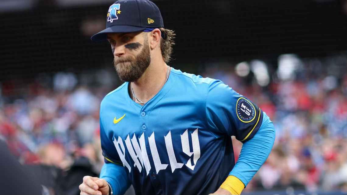
The Phillies decided to take one out of the page of their Northeast Corridor brethren Red Sox, abandoning their signature red for blue and yellow. But unlike the Red Sox, Philly really missed the mark aesthetically. The colors work (when does blue and yellow not), but the rest is just trying too hard. Props to them for taking out no stops when it comes to incorporating connections to the city, with multiple elements depicting or inspired by the Liberty Bell, a “cracked” pattern applied to the letters meant to evoke old documents such as the Declaration, and the blue color representing the blue-collar identity of the city. However, when all of these things are put together - and paired with navy pants at that - it just doesn’t work, and feels spectacularly out of place in contrast to the Phillies’ iconic everyday uniforms.
Grade - Aesthetics: 1, Connection: 7, Overall: 4
Pittsburgh Pirates - 2023
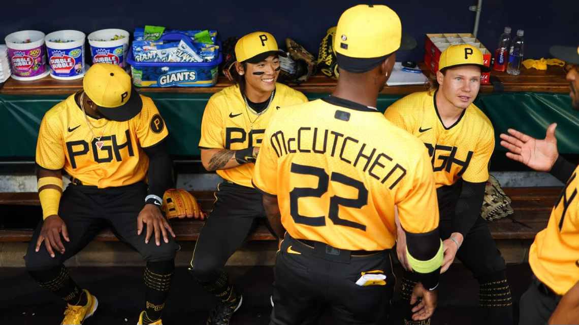
It is truly disappointing that these are so bad, but maybe that’s appropriate for a team that has had some of the most questionable uniforms of all time (yellow pants anyone??). The biggest problem here is they should be good. Normally I hate black baseball pants, but yellow is the one color they can be paired with and look great. There are some cool hidden elements that reference the city, including the steel industry, the surrounding rivers, and the iconic Clemente Bridge, but the overall styling skews far too modern for a team whose uniform elements have remained remarkably consistent since the late 1940’s. This could have been the perfect opportunity to bring back the sleeveless jerseys or quirky bicolor pinstripes of the past incorporating these same subtle patterns, paired with the pillbox cap the team wore for over a decade in the 70s and 80s.
Grade - Aesthetics: 4, Connection: 6, Overall: 5
San Diego Padres - 2022
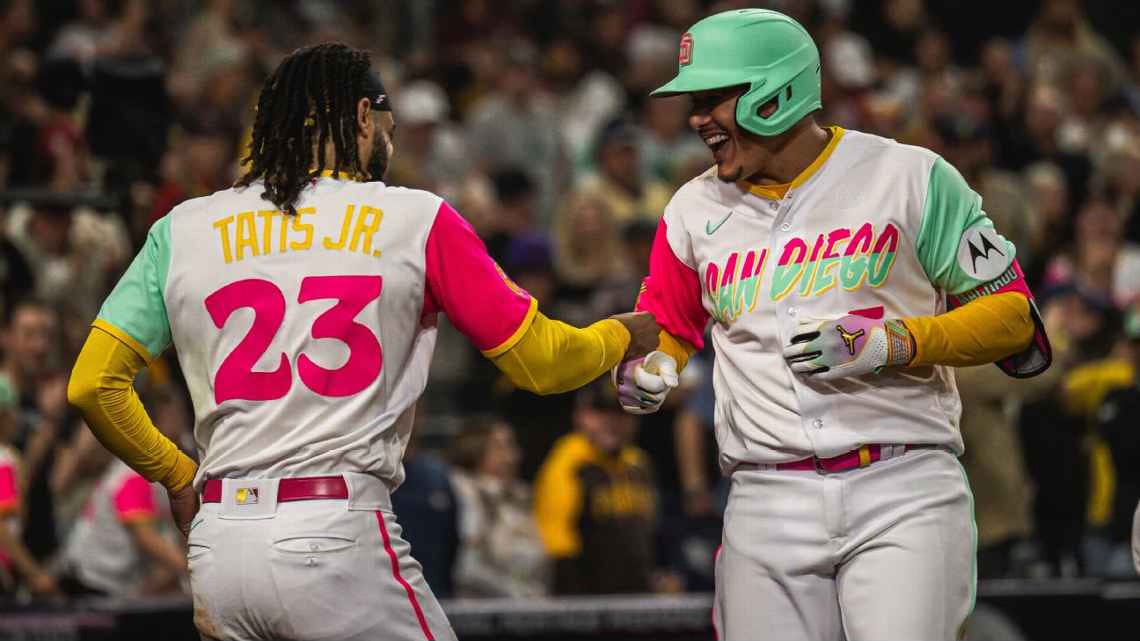
The Padres City Connects are a rare example of completely diverging from your iconic signature look (for the sake of this argument we’re just going to ignore the large segment of the team’s history when they abandoned brown and gold) and it works. The playful colors and lettering perfectly encapsulates the Southern California vibe of the city and region, and even finds a way to keep a through line to their everyday uniforms with a pop of yellow. Outside of the unique coloring, however, there’s no real attempt to make a connection to the city.
Grade - Aesthetics: 8, Connection: 3, Overall: 5.5
San Francisco Giants - 2021 (V1), 2025 (V2)


The Giants might have the dubious status as having the worst combination of 2 editions of City Connects. The initial version, debuted in 2021, paid tribute to the iconic Golden Gate Bridge and the notorious fog that rolls into the bay that every area resident knows. It’s a good try, but the fog effect doesn’t quite work and the color scheme leaves much to be desired.
A new version debuted earlier this year, taking a whole new approach. The concept is meant to evoke the historic connection of the Bay Area to the music industry, with elements meant to represent record grooves/sound waves, the Fillmore’s stage lights, and Haight-Ashbury posters. Outside of the glove patch (additionally referencing the iconic super-size glove in Oracle’s outfield promenade), none of these really work.
2021 Grade - Aesthetics: 4, Connection: 4, Overall: 4
2025 Grade - Aesthetics: 2, Connection: 4, Overall: 3
Seattle Mariners - 2023
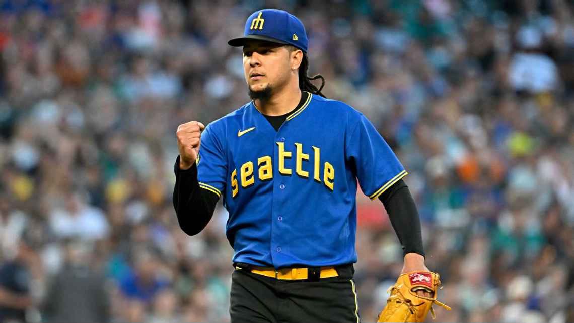
Similar to the Twins, this is a tough one to grade aesthetically. The jersey and hat are great (if you can get past the black brim). The black pants? Not so much. Why is there so much black? The answer to that question is tied up in what makes this an attempt at a City Connect at all - the theme is throwbacks. The lower-case chest-lettering evokes the Seattle Pilots, the first MLB team to call Seattle home (for exactly one season before moving to Milwaukee to become my Brewers). The trident logo on the hat is a throwback from the first years of the current Seattle Mariners franchise3. The black pants (and additional black accents) honor the Seattle Steelheads, a Negro League team from the 1940s. The other big problem here is that there’s no real attempt to connect with the city other than referencing other iterations of Seattle baseball from decades past.
Grade - Aesthetics: 4, Connection: 1, Overall: 2.5
St. Louis Cardinals - 2024
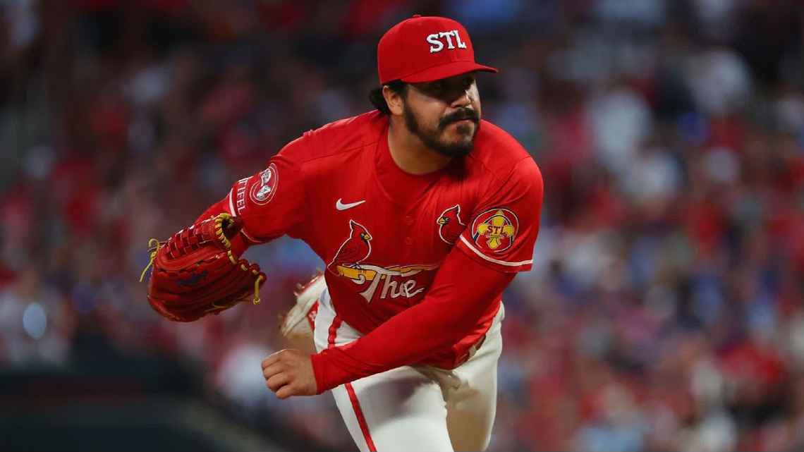
The Cardinals City Connects might be one of the most divisive of them all. For me, they work. They perfectly thread the needle, very similar to “Los Dodgers” in honoring the elements of a team’s iconic everyday uniforms, but done in a new way. “The Lou” replaces the “St. Louis” or “Cardinals” that normally adorn the chest, and while it may not be a particularly popular nickname for the city outside of Nelly fan clubs, it looks good with the bat and birds. This also marks the first time the Cards have rocked a red jersey outside of Spring Training, which came as a surprise to me given their mascot. These also go a step or two further than the Dodgers in terms of connecting to the city, incorporating a wavy tonal pinstripe and fleur de lis borrowed from the city flag, as well as the Gateway Arch. They could have done without the new hats, but that’s the only real problem with these.
Grade - Aesthetics: 8, Connection: 7, Overall: 7.5
Tampa Bay Rays - 2024
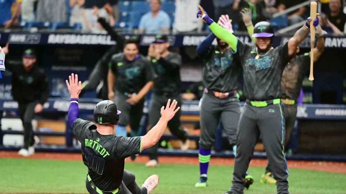
You have to hand it to the Rays for Going For It. They quite possibly have the most disparate elements, including flame letters, skateboards, pelicans, palm trees, bridges, and multiple textures. I’m not sure how many of them connect, but put all together they do somehow work rather cohesively. The grey-based uniform set, with neon green, purple, and blue accents, however, does not appeal to me.
Grade - Aesthetics: 2, Connection: 7, Overall: 4.5
Texas Rangers - 2023
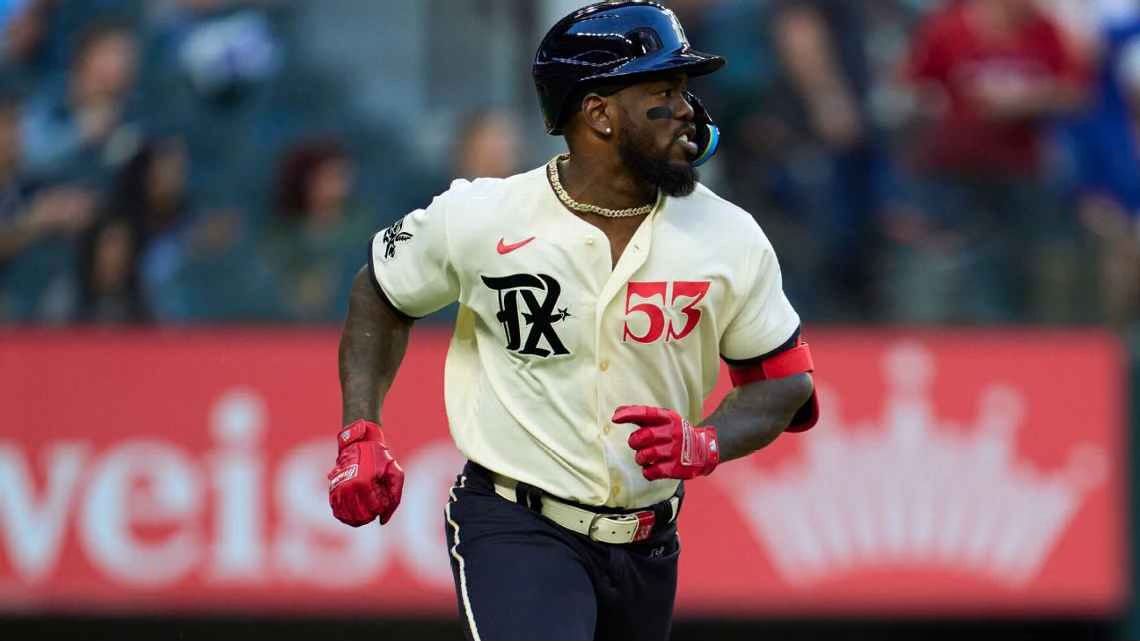
This is another example where my view differs greatly from other breakdowns I’ve read, and another example I think could form the basis for an overall rebrand. Normally I hate dark colored pants, and if they made these the everyday uniforms they might want to match the cream top, but here they work. Many of the concepts here play on the historic Texas baseball teams the Dallas Eagles, Fort Worth Panthers, and their predecessors in Arlington, the Dallas-Fort Worth Spurs. The combination of gothic and western fonts, and the mythical Peagle (Panther and Eagle hybrid) they created just for this purpose, may seem a bit out of left field but ultimately execute quite well. Add in the final touches of a rope motif and an emphasis on the date of April 21, and they successfully hit on the area’s history both metaphorically and aesthetically.
Grade - Aesthetics: 8, Connection: 10, Overall: 9
Toronto Blue Jays - 2024
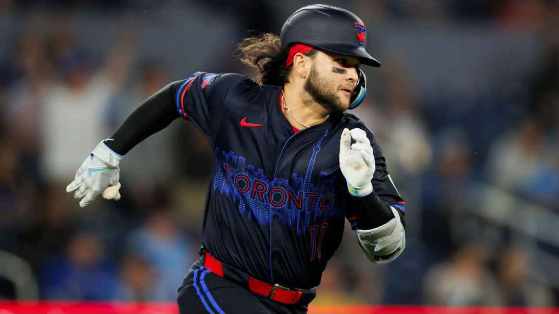
By now, you know all too well I am a hater of all-black baseball uniforms. I have to give the Blue Jays credit, however, for leaning into the bit and dubbing these the “Night Mode” uniforms, letting that bleed into some of the other details that round out the design. The somewhat-kitschy skyline at the chest is meant to look like it is lit up at night, while the blue stripes evoke the hue of Lake Ontario at night, reflecting the city lights. It is also a notable attempt to connect with the city by including “Toronto” on the jersey for the first time in over 2 decades. Further references to their home in Toronto include a new logo and sleeve-trim layout inspired by the city flag. True to the “Night Mode” theme, these are only worn at night, and the Rogers Center is a dome anyway, so I can’t peg them for a lack of practicality in choosing to wear all black.
Grade - Aesthetics: 7, Connection: 8, Overall: 7.5
Washington Nationals - 2022 (V1), 2025 (V2)


The Nationals’ original City Connects were better than they should have been given their uninspired grey base (is this supposed to represent the age of the average congressperson?) and the all-too-popular 3-letter city abbreviation on the chest. Looking past these two weaknesses, upon further inspection that grey jersey actually has a unique, allover floral pattern, and the letters are executed well, mirroring the marble architecture of the city. The finishing, and winning touch, to these is the Cherry Blossom branch framing those letters and petals and tree adorning the cap. If there is one thing Washington DC is known for as much as grey Senators, it is Cherry Blossoms.
The team apparently didn’t agree with my positive assessment of their original City Connects, however, as they debuted a new version earlier this year. The focus this time? The city’s grid, for some reason. The Cherry Blossom is relegated to accents on the hat and a sleeve patch, while more emphasis is put on the city’s role as the Capital, incorporating the silhouette of the capitol dome into into their new W logo. The new light blue color may be a slight upgrade but it hardly makes up for the rest.
2022 Grade - Aesthetics: 6, Connection: 6, Overall: 6
2025 Grade - Aesthetics: 6, Connection: 5, Overall: 5.5
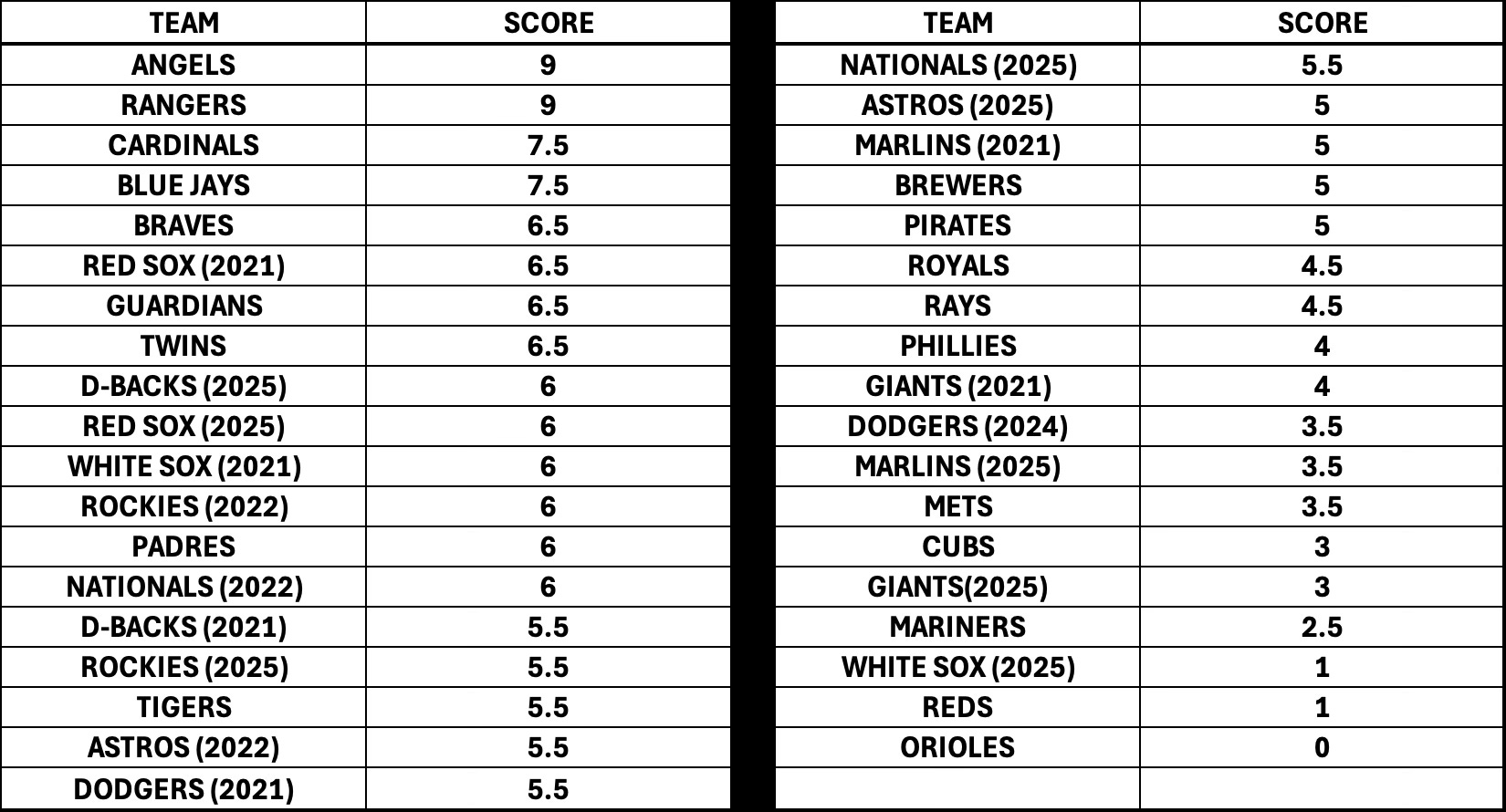
Now that I’ve graded each iteration for each team, here are the final rankings:
If there is anything I have learned, and hopefully imparted to you, reader, in going through this entire breakdown, is that my initial feeling was true. MLB and Nike’s City Connect experiment is incredibly mid. For every Angels or Rangers gem there’s a Reds or Orioles stinker, but most teams find themselves somewhere in the broad middle. In fact, the average score was just above 5, with the median only slightly higher at 5.5. The most lasting thing that we can hope to come out of this, is one or multiple of these teams use this experiment as a chance to find a much-needed new identity, and adopt their City Connects full time. Other than that, I can’t wait for this series to go away, and let teams go back to donning their own quirky alternates aligned with their own agenda (like the Brewers’ Cerveceros or the Red Sox St. Patty’s Day Greens).
In fact, speaking of those Red Sox, it came to my attention shortly before hitting publish that they aren’t retiring those original City Connects (fitting seeing as they cracked the top 10). Rather, they are adding them to their regular uniform rotation as one of their two allowed alternates based on Nike’s guidelines. Let’s hope some other teams follow suit.
Majestic was purchased by Fanatics in 2017, but produced MLB uniforms under their branding until 2019. In 2024, Fanatics took over production of MLB uniforms but with Nike branding, so I guess Majestic lives on in spirit.
The Yankees have been the one notable holdout of the grouping of teams with iconic uniforms to not launch a City Connect. The Athletics, meanwhile, have not debuted a City Connect because they don’t have a permanent home. The writing on the wall has been there for a while that they were not going to stay in Oakland, and they are now “temporarily” playing in Sacramento, with plans to find a permanent home in Las Vegas (but a timeline for building a stadium for them is unclear).
In reviewing the uniform history of both the Brewers and Mariners for this piece, I noticed an oddity which I was surprised anybody let happen. Both teams, with signature colors royal blue and yellow/gold, donned powder blue away uniforms as was the trend in the late 70s and early 80s, resulting in very similar looks. However, they weren’t the only teams to bear an eerie similarity to each other in 1980 and 81 when 11 teams wore powder blue aways, including the Twins, Expos, Cardinals, and Rangers all accenting with red, white, and blue, and the Blue Jays, Royals, and Braves all utilizing blue and white trim. In fact, the Cubs and Phillies were the only true standouts in this group, with the Phillies using their signature red and white as trim and the Cubs opting for pinstripes and forgoing trim altogether.