

Every USMNT World Cup Kit, Ranked
Has US Soccer finally found its identity, at least sartorially?

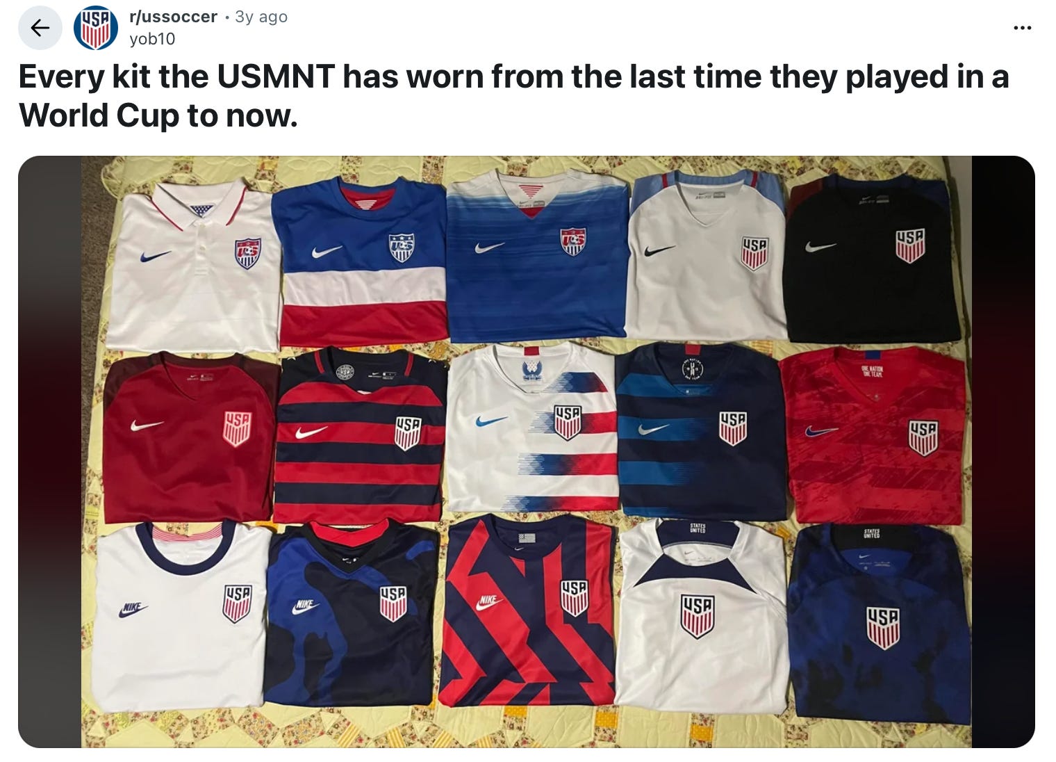
It’s a good thing there are only three colors in our flag, because even with such a limited palette, Nike and US Soccer have put together just about every orientation of those three colors under the sun. The only problem? The United States is hardly the only country with a red white and blue flag, but it IS an undeniably unique one. Why then, has US Soccer never been able to find a visual identity that defines them?
It’s hard to ignore the fact that the team itself has always struggled with an identity crisis, constantly struggling to prove they belong on the big stage of the World Cup with the likes of Brazil, Netherlands, Germany, England, France and others that all have historical success in the sport and iconic uniform identities. That lays the groundwork for the real driving force, in my opinion, and that’s profit-seeking, of course. Since Nike took over uniform production from Adidas in 1995, they have released 40-50 different kits, including both home and away. Obviously Nike wants to sell a new uniform for every World Cup, but I’d argue this has been SO excessive, when surely there’s not a huge market for non-World Cup jerseys in America of all places, that they have done far more harm than good.
I’ll spoil the end of my rankings by saying I am hopeful that Nike and US Soccer have turned a new page in 2026 looking ahead. Putting nostalgia aside, the USMNT will look better than they ever have in this year’s World Cup. So now let’s talk about the long journey it took to get here.
1990 (Italy)


After a 40 year drought of not qualifying for the World Cup, US Soccer reentered the picture with a whimper. Clearly an afterthought for an Adidas team that simultaneously produced one of the most iconic kits of all time for West Germany, these are just completely uninspired.
1998 (France)


Not to spoil anything further ahead, but after a tremendous showing in 1994, the 1998 kits left almost as much to be desired as in 1990. The jersey silhouette is weird, the detailing is bland, they simply don’t look like World Cup kits. They quite literally look like what I wore in high school. Look at Iran simultaneously stachemogging, framemoggings, and kitmogging us. Subtle foreshadowing, perhaps.
2002 (South Korea / Japan)


None of the teams dressed by Nike for the 2002 WC escaped the weird, angular color blocking below the pits that characterize these kits, and that was the last thing lost US team needed. It’s a good thing France was dressed by Adidas, because I have no idea how we would have been able to tell the two teams apart on the pitch. Well, besides their play, of course.
2014 (Brazil)


Admittedly, I have a bit of a soft spot for these, nostalgically. 2014 was just about the peak of my enthusiasm for US Soccer, and I will always remember watching our game against Portugal in a Parisian bar that we forced to stay open late. Sartorially, I’m a bit of a sucker for polo collars, and rather than the weird, shawl-collar polos from 1998, these were simply and classically finished. Meanwhile, the juxtaposition of the clean all-white “home” and bold color blocked “away” provides a versatility that I think is the greatest strength of the 2026 kits. However, looking back with a critical eye, I have to knock these for the fact that England already owns the all-white look, and the red shorts combined with the color blocked jersey puts the whole kit off balance for me.
2006 (Germany)


Something feels a bit off about these being so close to the top 5, but I promise there’s a reason I’m ranking these above the 2014 kits. While aesthetically, I do like the 2014 home whites more than either of these, at least here they tried to define their own look. At least the white jerseys look like something that could have become a regular, signature look. But they didn’t do that, so here we are.
2022 (Qatar)


These kits were the reason that Nike took a whole new, player-focused approach to 2026, and with the home whites you can really see why. Similar to the 2002 kits, the only design element is random angular colorblocking, while both home and away went with a monochromatic look. The execution of the dark blue away kits, featuring an irregular splotchy pattern, also leaves a lot to be desired, but I do think they were sort of on the right track by going with a more subdued look here.
2010 (South Africa)


Another victim to the whiteout apocalypse in uniforms, this set is again carried by the away kit. In a vacuum, I don’t love the execution of these any more than the 2022 kits, but what I do appreciate is the history (we’ll get to that in a second) of what they were going for. In an alternate universe, the sash stripe could have been a signature piece of USMNT identity. For some reason, it never fully took, and I don’t know why they went with a tonal stripe on the home whites, but A for effort.
1950 (Brazil)
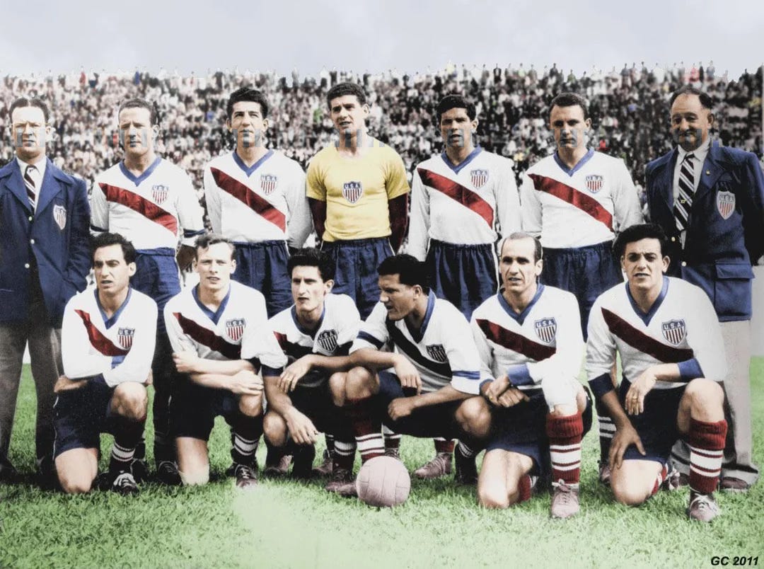
Believe it or not, the U.S. actually qualified for 3 of the first 4 World Cups (before going on a 40-year drought). In the first two cups (1930 and 1934), they went with simple white and blue shirts with some sort of crest, but 1950 was the first time the team had their own distinct look. It’s certainly of the time, but it could have been the basis for a signature uniform. I wonder if things would be different if the U.S. had continued to qualify in the intervening decades.
1994 (United States)


After a really poor effort in 1990, Adidas completely flipped the script in 1994, producing one of the most iconic one-off soccer jerseys in history (fittingly, Adidas just re-released it for 2026 as the WC is back stateside). They were 2-3 decades ahead of the curve with a sort of trompe l’oeil denim print adorned with white stars. The vertical stripes on the home kits look a bit off, but overall both of these have all the elements that could - and should - be through lines in every uniform they wear.
2026 (United States / Mexico / Canada)


I promise this post is not sponsored by Nike or the USMNT, but it is completely blasphemous to me that ESPN ranked these home kits 9 and away kits 14 out of the 18 different home and away uniforms the U.S. has donned since 1990. Ryan Rosenblatt really ranked the waving flag stripes one place ahead of the horrendous 1990 home kit. Shame on you, Ryan. But I digress.
What puts these above the rest, to me, is the clear logic in actually forming an on-pitch identity. It should be simple. We have a very unique flag that has two easily recognizable elements; repeated red and white stripes and stars on a deep shade of blue. Go with that. For away, something more subtle - in the words of the designers behind it, quoting the players’ request, something you can wear to the club.
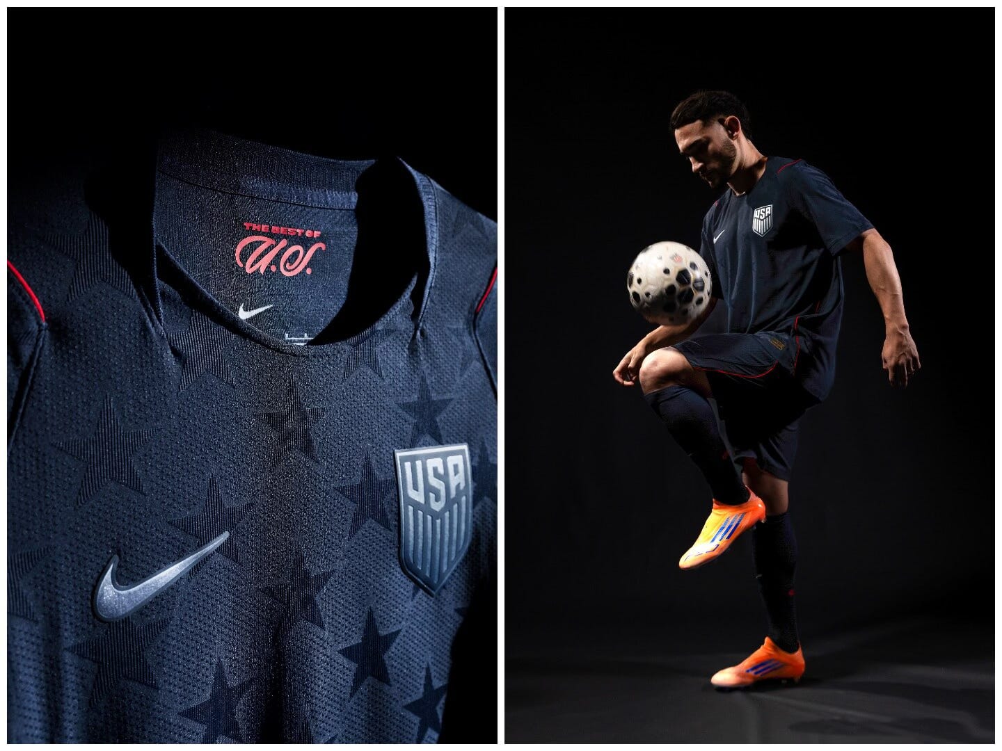
That’s the real success here. I can nitpick at the choice of plain navy shorts or the awkward box on the back for names and numbers or the choice to go full obsidian for away but bright navy for the home shorts, but what they achieved is executing a no-apologies “WE ARE AMERICA” kit as well as an incognito-mode version that still honors the American identity. The colors are subdued, but that sea of (dark grey) blue is spangled with stars that stand out amidst the unique weave.
The result is a formula that could be forever followed but always played with: Red and white (horizontal) striped jerseys, navy shorts. Just like when you see the Netherlands decked out in Orange, or Argentina in light blue and white vertical stripes, or Brazil in yellow jerseys and blue shorts, you’ll know it’s America. And then just lean into the wearability of navy and the iconic stars for the alternate.